AI of Things (XIII): Data visualisation for optimal fleet management
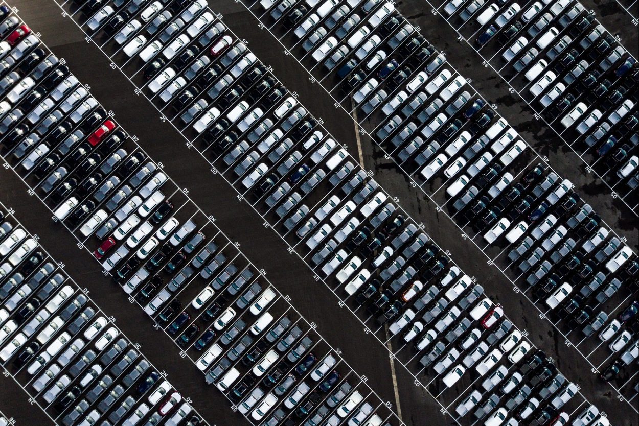
Witten by Víctor de Andrés AI & Analytics Full Stack Engineer at Telefónica Tech There is a current growing need for companies with fleets of vehicles to analyse the performance of their fleet and to anticipate preventive maintenance of vehicles. This requires a visualisation that allows us to see the most important indicators in a clear and simple way. In order to create an efficient visualisation that helps us to optimise the management of the vehicle fleet, the following steps should be followed. Definition of KPIs Each vehicle in the fleet generates a large amount and variety of data. Therefore, the first step is to create a list of the most important KPIs, those that will help us to achieve our objectives in a quick and easy way. Once we have defined our list of KPIs, we will group them according to the nature of the KPIs. We must ensure that the storytelling of the visualisation has continuity. An example of grouping, at a very high level, could be as follows: Driving behaviour data. Vehicle status data. Alarms. This grouping will allow us to create a first level of aggregation in our visualisation. In this way, the user will have quick and intuitive access to the KPIs they wish to visualise. Aggregation levels Prior to starting with the development of the visualisation, there is another important point to define, the level of aggregation. As we have indicated above, each vehicle provides us with a large amount and variety of data. In order to be able to carry out a correct visualisation, it is necessary to define aggregation levels that allow us to carry out the different analyses of the KPIs based on common metrics. An example of aggregation levels would be as follows: Date. Vehicle manufacturer / make. Vehicle model. These levels of aggregation are also defining the possible filters that we can have in our visualisation. AI of Things New business opportunities using Internet of Things (IoT) November 29, 2022 Data organisation Another important point for an optimal visualisation of the data is the organisation of the KPIs within each of the groups that we have previously defined. At the top of the visualisation we should always have the most important KPIs for the user and those with the highest aggregation. This will make it easier for the user to read the visualisation. We should always remember that the information the user should find is from most to least important, allowing the user to dive into the information in the logical direction of reading In the event that the number of KPIs to be represented had to be divided into several screens, we would follow this same pattern. Chart selection The selection of charts for the representation of information is also important. Depending on the information we want to represent, we will have to use some graphs or others, as each type of graph is used to show a certain type of information. Some of the most common graphics that can be used are the following: Bar chart: This chart is used to summarise data sets in categorical form. This chart will allow us to make comparisons between two or more values. Pie chart: Pie charts are used to show the proportional share of a data set over the total data. Line chart: Used to show series of data over a continuous range, usually over time. Allowing us to see at a glance both the general trend of a KPI, as well as the simultaneous comparison with other KPIs in the same time range. Histogram: Visually similar to a bar chart, but instead of comparing categories, it shows how the data for a single category is distributed over time. Area chart: Similar to line charts, these charts are used to represent cumulative totals over time. In addition to representing a proportional share of a total, area charts are used to show the distribution of data for a single category over time. These are some of the types of graphics we can work with. But the ones described above are the ones we will mostly work with when we develop our visualisation for the control of a fleet of vehicles. Another important characteristic to consider when creating the graphics is their colour. The colours must be within the range of colours of the corporate style and must not be informative. Titles Once we have defined all the graphs that we are going to include in our visualisation, the last step we must take is to define the titles of each graph. Each graph must have a title that tells the user what the graph represents. This information is very important because we are indicating to the user what we are representing in each KPI. Conclusion Once we have developed our visualisation with the steps we have seen above, we will be able to proactively manage our vehicle fleet. This visualisation will allow us to, among other actions, for example: Obtain different insights on the condition of the vehicles and carry out proactive maintenance that allows us to reduce the repair time of the vehicles, as well as their useful life. Know the behaviour of drivers to be able to drive more efficiently and increase driver safety. Optimise delivery routes to optimise distribution costs. Here are some examples of the benefits that can be gained by having a visualisation for fleet management. 🔵 More content on IoT and Artificial Intelligence can be found in other articles in our series – the first article of which can be found here, AI OF THINGS AI of Things(I): Multiplying the value of connected things February 28, 2022
December 13, 2022
 Hybrid Cloud
 Cybersecurity
 Data & AI
 IoT & Connectivity
 Industry
 Health
 Banking and Finance
 Public Sector
 Retail
 Tourism and Leisure
 Transport & Logistics
 Energy & Utilities
 Smart Cities