 Hybrid Cloud
 Cybersecurity
 Data & AI
 IoT & Connectivity
 Industry
 Health
 Banking and Finance
 Public Sector
 Retail
 Tourism and Leisure
 Transport & Logistics
 Energy & Utilities
 Smart Cities

Data storytelling: techniques, examples and tools to tell stories with data
In today’s world, data visualisation has become an essential tool for communicating information clearly and effectively. But data alone tells us nothing: it needs context and a narrative to make it understandable and relevant.
It’s not just about showing numbers or charts, but about telling a story that captures the audience’s attention and helps make sense of complex information. This is what we call data storytelling: the art of telling a story with data.
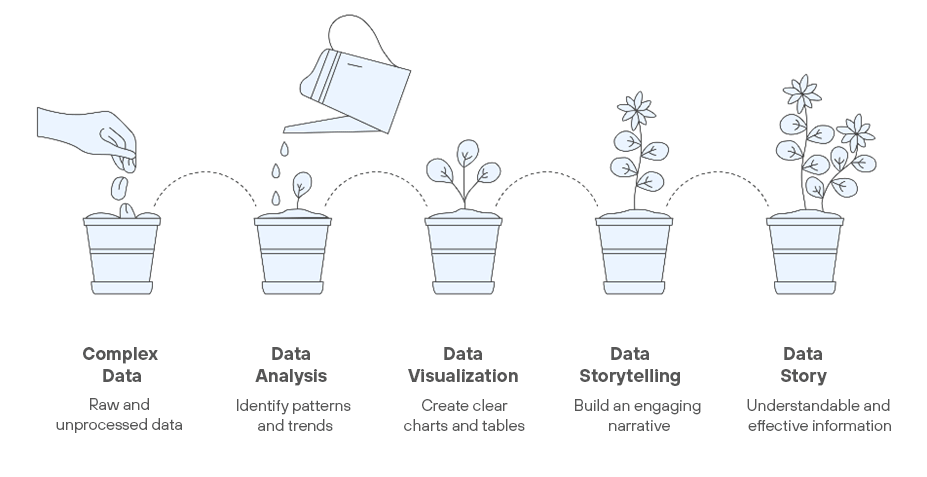
The main advantage of presenting data this way is that the messages grab the audience’s attention more effectively, are easier to remember and, most importantly, enable more efficient decision-making.
Data has more impact when it’s understood, remembered and used.
Key elements of data storytelling
To tell a story with data, it’s essential to understand and apply three core pillars:
- Data: the foundation of everything, so it must be relevant—it needs to add value. It must also be accurate; avoiding errors is essential to maintain the credibility of your story. And finally, data should be contextualised to improve understanding. Key takeaway: A data point without context may be correct, but it won’t be useful.
- Visualisations: choosing the right visuals is key to conveying meaning at a glance. Key takeaway: Every chart should reinforce your message—not compete with it.
- Narrative: this is what turns your data and visuals into a coherent story that guides your audience from the initial context to a clear conclusion. Key takeaway: The narrative is the thread that ties all the information together.
How to tell a compelling story with data
To craft a strong narrative, it’s important to follow a few key steps:
- Define your goal: before you begin, ask yourself what you want to achieve. What message do you want your audience to take away? Being clear about your purpose will help you select and prioritise data and shape your story.
- Know your audience: every audience is different, and that impacts how you present the data. If you're speaking to experts, you can dive into more technical detail. For a general audience, it’s best to simplify and keep things accessible.
- Structure your story: every good story has a beginning, middle and end. Start by presenting the problem or context, then showcase the data and findings, and wrap up with a clear conclusion or recommendation.
- Use visuals wisely: charts are your allies, but not all serve the same purpose. Use bar charts for comparisons, line charts to show trends, and scatter plots for relationships. What matters is that every visual is easy to understand and supports your message.
- Simplify and focus: less is more. Remove anything that’s not essential. And when possible, “humanise” the data: show how it affects real people or situations your audience can relate to.
- Add context: include visualisations with enough context to convey the main idea without lengthy explanations.
Real-life success story: Hans Rosling and Gapminder
One of the most striking examples of data storytelling is the work of Swedish physician and statistician Hans Rosling, who transformed the way we understand global development.
For years, we heard the same story: the world is divided into rich countries and poor countries. But when Rosling took a closer look at the data, he realised that this narrative didn’t match reality.
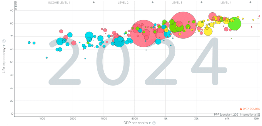
To prove it, he gathered information on health, economy and education from over 200 countries and created animated visualisations using Gapminder. The power wasn’t just in the data—it was in how he presented it.
Rosling always started with a commonly held belief about the old division between rich and poor. Then he would rewind time to the year 1800 and show a scatter plot where each country appeared as a bubble that moved through time.
 Click to access the interactive Gapminder chart.
The size, colour and position of each bubble would change to reflect the evolution of life expectancy, GDP per capita and population. As the bubbles moved, grew and converged, the audience could see how the data shattered the myth of a rigid divide between "rich" and "poor" countries.
The result?
Rosling didn’t just show numbers—he changed how the world understood development, influenced public policy and took data storytelling to a whole new level. His TED Talk went on to become one of the most viewed of all time.
Tools to boost your storytelling
Some widely used tools for data analysis and visualisation include:
- Tableau: known for its ability to create highly visual, interactive dashboards. It’s powerful when handling large data volumes and offers great flexibility in chart creation. Its main drawback is a steeper learning curve.
- Power BI: ideal for integrating data within the Microsoft ecosystem and building business reports. It offers a strong balance between power and ease of use, along with robust data modelling. However, its visualisation capabilities are more limited than Tableau, and advanced use of DAX can be challenging.
- Google Looker Studio: a free, accessible option for visual reporting—perfect for users working within the Google ecosystem. It’s easy to use and convenient for sharing reports. That said, it has fewer deep analytics capabilities and may struggle with large datasets.
These tools help turn complex data into clear visualisations that support your narrative.
The key isn’t the tool itself, but how you integrate it into your story.
Common mistakes in data storytelling
Some frequent pitfalls when telling stories with data include:
- Overloading visualisations: using overly complex visuals, too much data or low contrast colours can make it harder to understand the message or extract clear insights.
- Choosing the wrong visualisation: a poorly chosen chart won’t help the audience grasp the information being presented.
- Ignoring the audience: even the best visualisation will fall flat if it’s not tailored to your audience’s level of understanding.
Conclusion
Data storytelling is a highly effective way to present data by making it more accessible, understandable and relevant. By combining accurate data, effective visualisations and a well-structured narrative, you can guide your audience through a story that leads to smarter, more efficient decisions.
Remember: when communicating data, it’s not just about showing charts and numbers in isolation, but about telling a story that inspires action.

Header image by Peoplecreations on Freepik.