 Hybrid Cloud
 Cybersecurity
 Data & AI
 IoT & Connectivity
 Industry
 Health
 Banking and Finance
 Public Sector
 Retail
 Tourism and Leisure
 Transport & Logistics
 Energy & Utilities
 Smart Cities

A brief history of data visualization
Historical evolution of data visualization
The process involved in creating a data visualization consists of transforming a dataset into symbols or visual representations that make it easier to understand. Since the origins of humanity, people have relied on different symbolic systems to represent reality and communicate information.
Language, which emerged around 70,000 years ago, marked the first major milestone in human representational capacity. It enabled us to build a mental picture of the world, imagine scenarios and predict events. The development of language became a turning point in social evolution, allowing small communities to grow into complex societies that eventually spread across the planet.
Later came pictographic representations, such as cave paintings, which—unlike spoken language—had a lasting nature. These visual expressions strengthened collective memory and supported the intergenerational transmission of knowledge.
The appearance of writing around 8,000 years ago was fundamental to the dissemination of laws, the recording of commercial transactions and the consolidation of administrative structures. Language, cave paintings and writing, together with other systems of signs, have had a profound and lasting impact on the development of human societies.
The origins of quantitative representation
In more recent times, the earliest forms of quantitative data visualization were used to represent astronomical phenomena, such as planetary orbits, around the 2nd century AD.
During the 17th century, maps began to include economic, geographic and geological variables, reflecting a growing interest in studying population, land ownership and tax collection.
In this same period, astronomy and physics adopted the graphic representation of measurements such as distance, time and mass, driven by the invention of René Descartes’ Cartesian plane, a fundamental tool for the mathematical and visual representation of relationships between variables.
During the 18th century, the Englishman William Playfair introduced the main forms of statistical visualization that are still used today, including bar charts, line charts and pie charts. Later, in the 20th century, scientific visualization experienced remarkable growth, spurred by technological advances and the increasing availability of data.
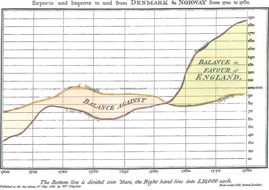 Time-series chart of the trade balance of Denmark and Norway, published in Playfair’s Commercial and Political Atlas. Source: INE.
Data visualization as a medium for understanding
The essential purpose of a data visualization is to translate the information contained in a dataset into a form that is understandable to the human mind. With the development of computing and digital technologies, new tools emerged incorporating interactivity, dynamic filters and other capabilities that enable deeper, more intuitive and more effective data exploration.
According to John Tukey, “the greatest value of a visualization is when it forces us to notice what we were not expecting.” A paradigmatic example of this idea can be found in John Snow’s cholera map from the 19th century.
The case of John Snow and epidemiological visualization
The physician John Snow, active in London during a cholera outbreak in the 19th century, challenged the prevailing belief that the disease was transmitted through the air. Convinced that the contagion spread through contaminated water, he decided to collect and graphically represent mortality data associated with the city’s different water pumps.
Snow produced a detailed map of London in which he marked cholera deaths using lines and the water pumps using black circles. The visual analysis of this representation revealed a clear concentration of deaths around a specific water source, while peripheral areas showed almost no cases.
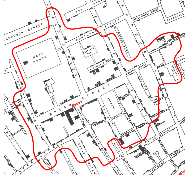 John Snow’s cholera map — Source: Cuaderno de Cultura Científica.
A particularly illustrative finding came from a brewery located near the contaminated pump, whose workers did not fall ill because they consumed water from their own private well.
Snow’s visualization provided compelling empirical evidence that cholera was transmitted through water, disproving earlier theories and laying the foundations of modern epidemiology. This case exemplifies how a visual representation can reveal hidden patterns and lead to scientific breakthroughs of great significance.