 Hybrid Cloud
 Cybersecurity
 Data & AI
 IoT & Connectivity
 Industry
 Health
 Banking and Finance
 Public Sector
 Retail
 Tourism and Leisure
 Transport & Logistics
 Energy & Utilities
 Smart Cities

Mistakes to avoid in data visualization
In many occasions the first impression is what makes the difference and the world of data visualization is not going to be an exception.
This article will expose the most common errors in data visualization, as well as small tips to prevent these types of errors from tarnishing the work done.
Color abuse
Special attention should be paid to the proposed color palette when carrying out a visualization project, regardless of the tool in which it is to be executed. This should incorporate colors with related tonalities and if possible clear so that it does not break the aesthetics, always respecting the corporate colors in case there are any.
It is also advisable not to use colors that lead to false interpretations such as red, which has a negative connotation, or green, which has a positive connotation, among other colors.
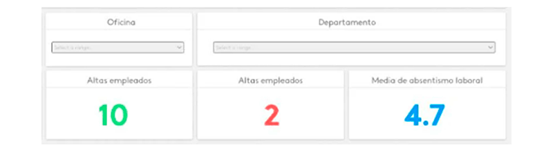 Source: Kenjo.io.
Visual disorder
Visual disorder is one of the most repeated mistakes, this error penalizes the good understanding of the proposed visualization. It is recommended to include a limited number of graphics where the screen is not overloaded, if necessary, the screen should be duplicated in order to have enough space for all the desired widgets.
It is convenient to include the information according to the detail from the upper left margin to the right from less to more detail. This technique is done to facilitate the reader's understanding, where the reader will be reading the tab in a natural way.
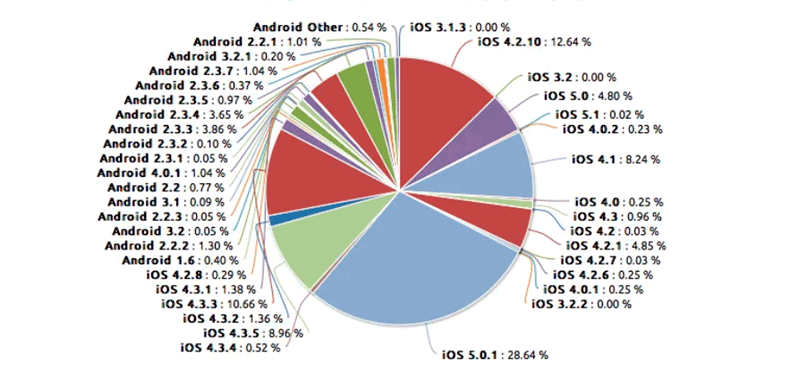
Information overload / Chartjunks
Linked to the previous point would arise this error of information overload, where there would be a series of graphs with multiple information where by wanting to include too much information we penalize the understanding of this.
In the case, for example, of wanting to segment an indicator by multiple categories, the fact that there are many categories may practically dilute them, making it impossible to understand them.
A solution would be to propose groupings of the desired segmentations or a sampling of them.
Lack of white space
Not including adequate spaces between widgets makes the visualization unpleasant to the eye, so it is vital to include the appropriate white spaces, as well as to respect the alignments between them.
Incorrect use of graphics
It is essential to incorporate a graphic according to the desired representation in order to correctly understand the insight presented in the visualization. If, for example, you wish to observe the evolution of an indicator, a line graph should be applied; any other visualization would be misleading.
Lack of adequacy between the visualization project and its audience
The use of technical terms or vocabulary with which stakeholders are not familiar may lead to a lack of understanding and loss of interest.
Need to simplify understanding for the audience.
The need for users to perform simple calculations based on the data represented in the visualization is inadequate. Simplified data should be included in the visualization, so that the user receives the information as desired as far as possible.
Inadequate context of included graphs
It is common that the graphs included in the visualization do not incorporate an adequate context, i.e. lack of units of measurement, data axes, data axes included but not starting at zero, scales that are not well adjusted to the data represented.
To solve this problem, special attention has to be paid to this kind of details.
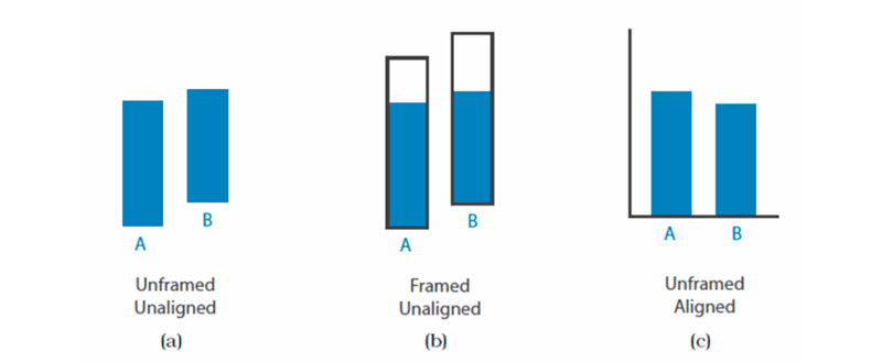 Source: Internal documentation.
Lack of headings and explanations
Additional information should be included to facilitate users' understanding of the visualization. Either in the form of titles, tooltips or both.
Lack of synchronization of multiple font formats
Inconsistency in the visualization between different font types, sizes or text shape is common. It is advisable to include a maximum of three different font types where the same typeface, but in bold typeface counts as one.
The font size can also be used to highlight data of interest above the rest. It should be noted that the rule applied in the visualization has to be extrapolated to the total of the visualization.

Image: Kroshka Nastya / Freepik.