 Hybrid Cloud
 Cybersecurity
 Data & AI
 IoT & Connectivity
 Industry
 Health
 Banking and Finance
 Public Sector
 Retail
 Tourism and Leisure
 Transport & Logistics
 Energy & Utilities
 Smart Cities
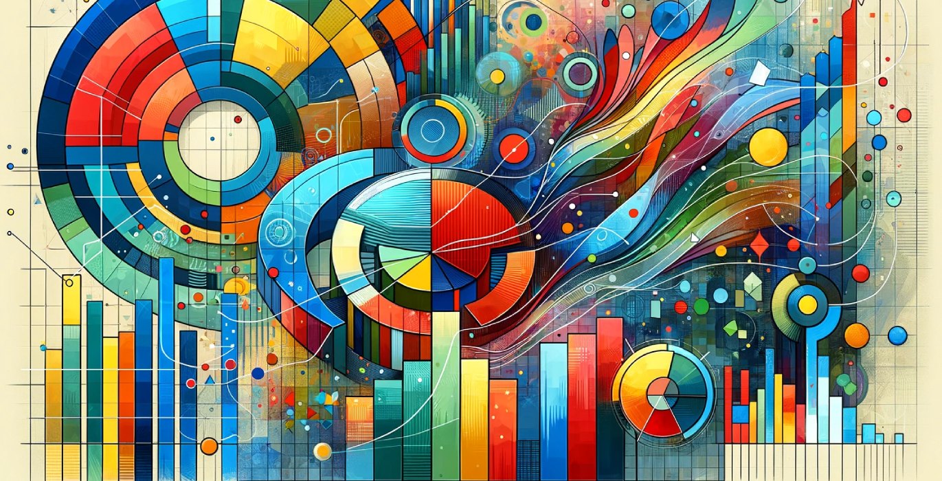

Data visualization: Choosing the right chart
Data is the new oil of companies, and the exploitation of data can set a company apart within the same sector. Thanks to the reduction in storage costs, a multitude of information is now available. Companies have large volumes of data at their disposal, and it is essential to give them shape so that they can be quickly and fully understood.
It is in this context that the science of data visualization arises, which tries to provide a solution to the above problem, when human processing capacity is not enough to contrast and analyze massive amounts of information.
Visualization allows, in a clear and direct way, to observe patterns, extreme values or distributions, among other possibilities, which help to make better decisions based on data.
In this article, we will discuss the main functions that can be solved by means of an appropriate selection of specific graphs. As there are many different graphs and as this is an introductory text, we will focus on giving technical answers prioritizing the most used graphs.
When constructing a dashboard, it should not be forgotten that, in addition to the wide range of graphics available, it is essential to take into account the context and the target audience.
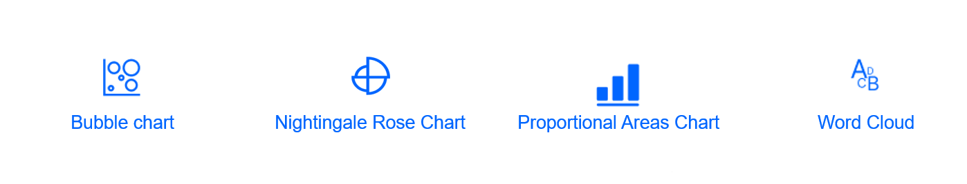
Proportional views
In this section we will look at those graphs that respond to the need to create a proportion between values. Graphs like the bubble graph, Nightingale Rose graph, proportional area graph or word cloud would give good results.
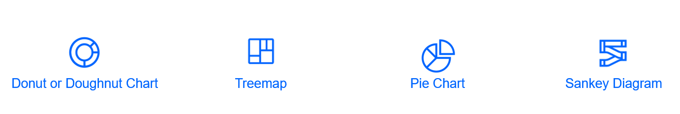
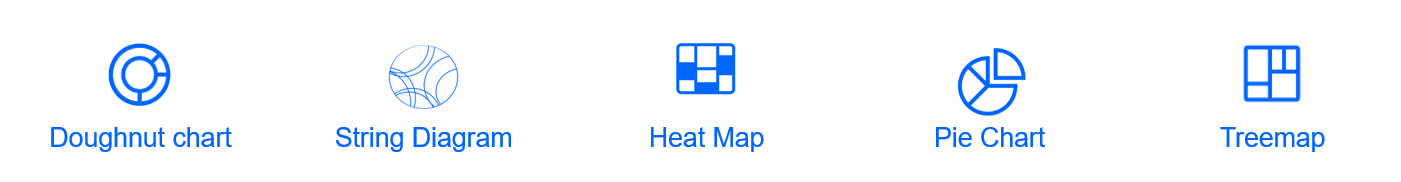
In case of looking for proportional links that form part of a total, the graphs to implement would be the donut or ring graph, treemap, pie graph, and Sankey diagram.
Hierarchy
The most commonly used graphs to show the hierarchy between a set of variables are the tree diagram graph and the treemap.

Concept visualization
Graphs such as Venn diagrams or flowcharts would be used to visualize some ideas or concepts.

Links
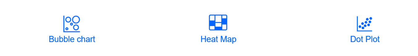
To observe both connections and links between data or to show correlations between two or more variables, an example of the most common graphs would be the following:
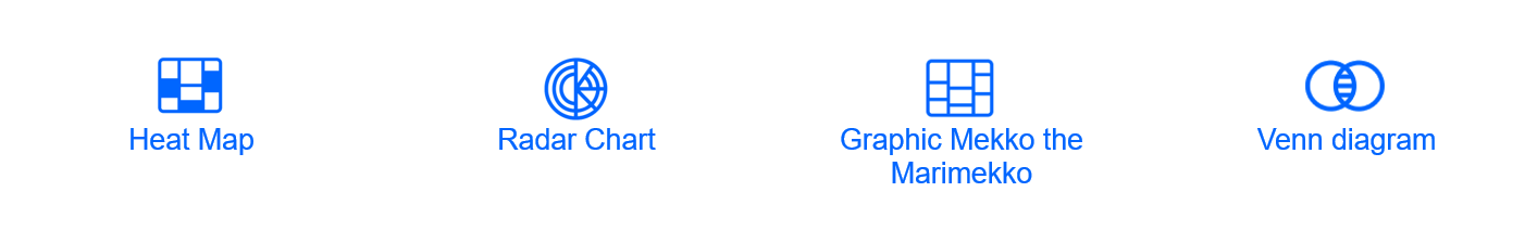
As far as correlations are concerned, the most appropriate charts are a bubble chart, heat map or dot plot.
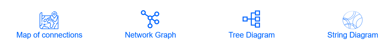
When it comes to showing only connections between different variables, the most suitable graphs are the connection map, network graph, tree diagram and the chord diagram.
Locations
The following are suitable methods for representing geographical regions: choropletic map, connection map, and point map.

Distributions
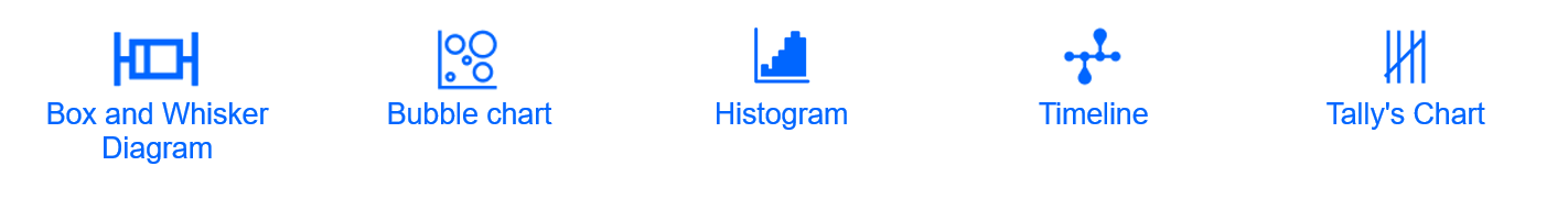
The following graphs are used to represent the frequency of a variable or its distribution, i.e., how it is distributed according to specific groupings.
The graphs that help to capture this idea are boxplot or box-and-whiskers diagram, bubble graph, histogram, timeline, or the Tally graph.
If you want to show the distribution of a variable segmented by a specific qualitative variable, whether it is sex, age or any other, the appropriate graph would be the pyramid. In the case of the word cloud, its use is optimal when dealing with the distribution of a text.

Make a comparison
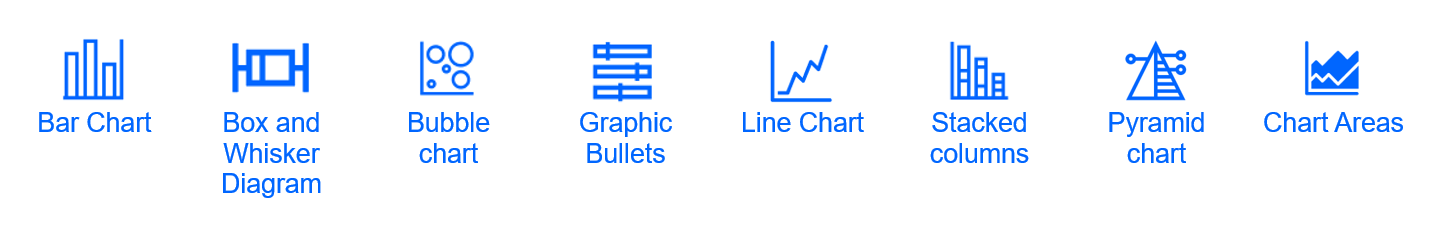
Methods that allow us to show the main differences or similarities between values. We can differentiate all the possibilities depending on the need to incorporate axis or not the graphs.
If they have an axis, the graphics to apply would be such as the bar graph, boxplot, bubble graph, bullet graph, line graph, stacked column graph, pyramid graph or area graph.
If they do not incorporate an axis in their structure, the graphs to compare different variables would be some such as ring or donut graph, chord diagram, heat map, pie graph, treemap, among others.
Movement Flows
The visualization methods that allow to represent the movement of data or data flows are the connection map or the Sankey diagram.

Partitions of a total
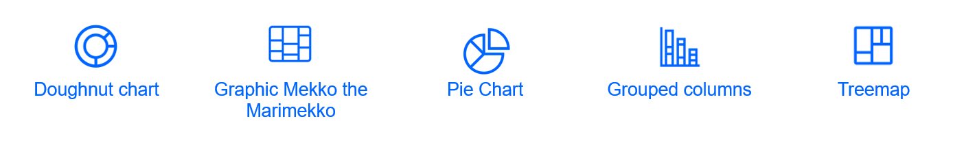
This section discusses those visualization methods that allow to show parts of a total of one or more variables. Generally, the ring or donut graph, Mekko graph, pie graph, clustered column graph and treemap would give a correct result.
Ranges
Display methods that present the variations between maximum and minimum values on a scale.
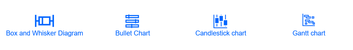
For this functionality the boxplot, bullet graph, candlestick graph, Gantt diagram among others will be a very good option to implement.
Display processing and operation
Visualization methods that allow to show how an object, a system, works, where the final output is shown together with the processes that originate it.
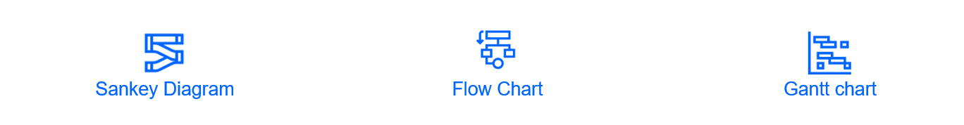
The most suitable graphics to show this type of functionality are the Sankey diagram or a flow graph, if what is desired is to focus on the explanation of processes or methods, the most advisable graphic would be the Gantt diagram.
Temporal data observation
This function presents the need to display data over a period of time as a way to find trends or changes over time.
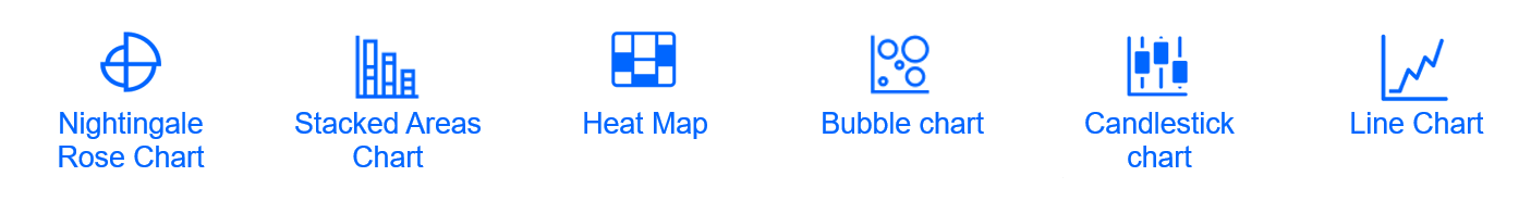
The graphs to employ could be the Nightingale Rose graph, stacked area graph, heat map, bubble graph, candlestick graph or line graph among others.
This section, which primarily serves to observe how data oscillates over time, also features graphs that could be used to represent the sequence of events over time. Graphs such as a timetable, a timeline or a calendar table can help to represent this type of information.

Discover hidden patterns
When selecting the graph, if the aim is to find hidden patterns within the data, the range of possibilities is very wide, and you can select one from a multitude of graphs.
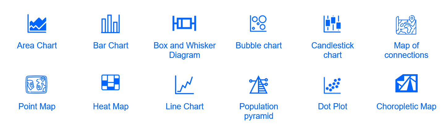
In this case, the most commonly used graphs are the area graph, bar graph, boxplot, bubble graph, candlestick graph, connection map, dot plot, heat map, line graph, population pyramid, dot plot, choropleth map, among others.
Conclusion
Data visualization is an indispensable tool to give shape and structure to data and to understand it quickly and effectively. Graphs are a clear and direct way to visualize patterns and distributions in data, which helps to make decisions based on more accurate information.
Although as we have seen there are many types of graphs, it is important to select those that are most appropriate for each situation taking into account the context and the target audience. Therefore, the right choice of chart is essential to make the most of the potential of the data and get the most out of it.