 Hybrid Cloud
 Cybersecurity
 Data & AI
 IoT & Connectivity
 Industry
 Health
 Banking and Finance
 Public Sector
 Retail
 Tourism and Leisure
 Transport & Logistics
 Energy & Utilities
 Smart Cities
Sara Hernando Navarro
I am passionate about technology, data, and business. These fields are all directly related to my current position as a Data Visualizer at Telefónica Tech. I enjoy low-code apps, web design, and learning new things. My work experience includes both public and private sectors in the field of data analysis and visualization.

A brief history of data visualization
Historical evolution of data visualization The process involved in creating a data visualization consists of transforming a dataset into symbols or visual representations that make it easier to understand. Since the origins of humanity, people have relied on different symbolic systems to represent reality and communicate information. Language, which emerged around 70,000 years ago, marked the first major milestone in human representational capacity. It enabled us to build a mental picture of the world, imagine scenarios and predict events. The development of language became a turning point in social evolution, allowing small communities to grow into complex societies that eventually spread across the planet. Later came pictographic representations, such as cave paintings, which—unlike spoken language—had a lasting nature. These visual expressions strengthened collective memory and supported the intergenerational transmission of knowledge. The appearance of writing around 8,000 years ago was fundamental to the dissemination of laws, the recording of commercial transactions and the consolidation of administrative structures. Language, cave paintings and writing, together with other systems of signs, have had a profound and lasting impact on the development of human societies. The origins of quantitative representation In more recent times, the earliest forms of quantitative data visualization were used to represent astronomical phenomena, such as planetary orbits, around the 2nd century AD. During the 17th century, maps began to include economic, geographic and geological variables, reflecting a growing interest in studying population, land ownership and tax collection. In this same period, astronomy and physics adopted the graphic representation of measurements such as distance, time and mass, driven by the invention of René Descartes’ Cartesian plane, a fundamental tool for the mathematical and visual representation of relationships between variables. During the 18th century, the Englishman William Playfair introduced the main forms of statistical visualization that are still used today, including bar charts, line charts and pie charts. Later, in the 20th century, scientific visualization experienced remarkable growth, spurred by technological advances and the increasing availability of data. Time-series chart of the trade balance of Denmark and Norway, published in Playfair’s Commercial and Political Atlas. Source: INE. Data visualization as a medium for understanding The essential purpose of a data visualization is to translate the information contained in a dataset into a form that is understandable to the human mind. With the development of computing and digital technologies, new tools emerged incorporating interactivity, dynamic filters and other capabilities that enable deeper, more intuitive and more effective data exploration. According to John Tukey, “the greatest value of a visualization is when it forces us to notice what we were not expecting.” A paradigmatic example of this idea can be found in John Snow’s cholera map from the 19th century. The case of John Snow and epidemiological visualization The physician John Snow, active in London during a cholera outbreak in the 19th century, challenged the prevailing belief that the disease was transmitted through the air. Convinced that the contagion spread through contaminated water, he decided to collect and graphically represent mortality data associated with the city’s different water pumps. Snow produced a detailed map of London in which he marked cholera deaths using lines and the water pumps using black circles. The visual analysis of this representation revealed a clear concentration of deaths around a specific water source, while peripheral areas showed almost no cases. John Snow’s cholera map — Source: Cuaderno de Cultura Científica. A particularly illustrative finding came from a brewery located near the contaminated pump, whose workers did not fall ill because they consumed water from their own private well. Snow’s visualization provided compelling empirical evidence that cholera was transmitted through water, disproving earlier theories and laying the foundations of modern epidemiology. This case exemplifies how a visual representation can reveal hidden patterns and lead to scientific breakthroughs of great significance. AI & Data Mistakes to avoid in data visualization September 30, 2024
November 18, 2025

Mistakes to avoid in data visualization
In many occasions the first impression is what makes the difference and the world of data visualization is not going to be an exception. This article will expose the most common errors in data visualization, as well as small tips to prevent these types of errors from tarnishing the work done. Color abuse Special attention should be paid to the proposed color palette when carrying out a visualization project, regardless of the tool in which it is to be executed. This should incorporate colors with related tonalities and if possible clear so that it does not break the aesthetics, always respecting the corporate colors in case there are any. It is also advisable not to use colors that lead to false interpretations such as red, which has a negative connotation, or green, which has a positive connotation, among other colors. Source: Kenjo.io. Visual disorder Visual disorder is one of the most repeated mistakes, this error penalizes the good understanding of the proposed visualization. It is recommended to include a limited number of graphics where the screen is not overloaded, if necessary, the screen should be duplicated in order to have enough space for all the desired widgets. It is convenient to include the information according to the detail from the upper left margin to the right from less to more detail. This technique is done to facilitate the reader's understanding, where the reader will be reading the tab in a natural way. Information overload / Chartjunks Linked to the previous point would arise this error of information overload, where there would be a series of graphs with multiple information where by wanting to include too much information we penalize the understanding of this. In the case, for example, of wanting to segment an indicator by multiple categories, the fact that there are many categories may practically dilute them, making it impossible to understand them. A solution would be to propose groupings of the desired segmentations or a sampling of them. Source. Lack of white space Not including adequate spaces between widgets makes the visualization unpleasant to the eye, so it is vital to include the appropriate white spaces, as well as to respect the alignments between them. Incorrect use of graphics It is essential to incorporate a graphic according to the desired representation in order to correctly understand the insight presented in the visualization. If, for example, you wish to observe the evolution of an indicator, a line graph should be applied; any other visualization would be misleading. Lack of adequacy between the visualization project and its audience The use of technical terms or vocabulary with which stakeholders are not familiar may lead to a lack of understanding and loss of interest. Need to simplify understanding for the audience. The need for users to perform simple calculations based on the data represented in the visualization is inadequate. Simplified data should be included in the visualization, so that the user receives the information as desired as far as possible. Inadequate context of included graphs It is common that the graphs included in the visualization do not incorporate an adequate context, i.e. lack of units of measurement, data axes, data axes included but not starting at zero, scales that are not well adjusted to the data represented. To solve this problem, special attention has to be paid to this kind of details. Source: Internal documentation. Lack of headings and explanations Additional information should be included to facilitate users' understanding of the visualization. Either in the form of titles, tooltips or both. Lack of synchronization of multiple font formats Inconsistency in the visualization between different font types, sizes or text shape is common. It is advisable to include a maximum of three different font types where the same typeface, but in bold typeface counts as one. The font size can also be used to highlight data of interest above the rest. It should be noted that the rule applied in the visualization has to be extrapolated to the total of the visualization. IA & Data Data visualization: Choosing the right chart December 13, 2023 Image: Kroshka Nastya / Freepik.
September 30, 2024
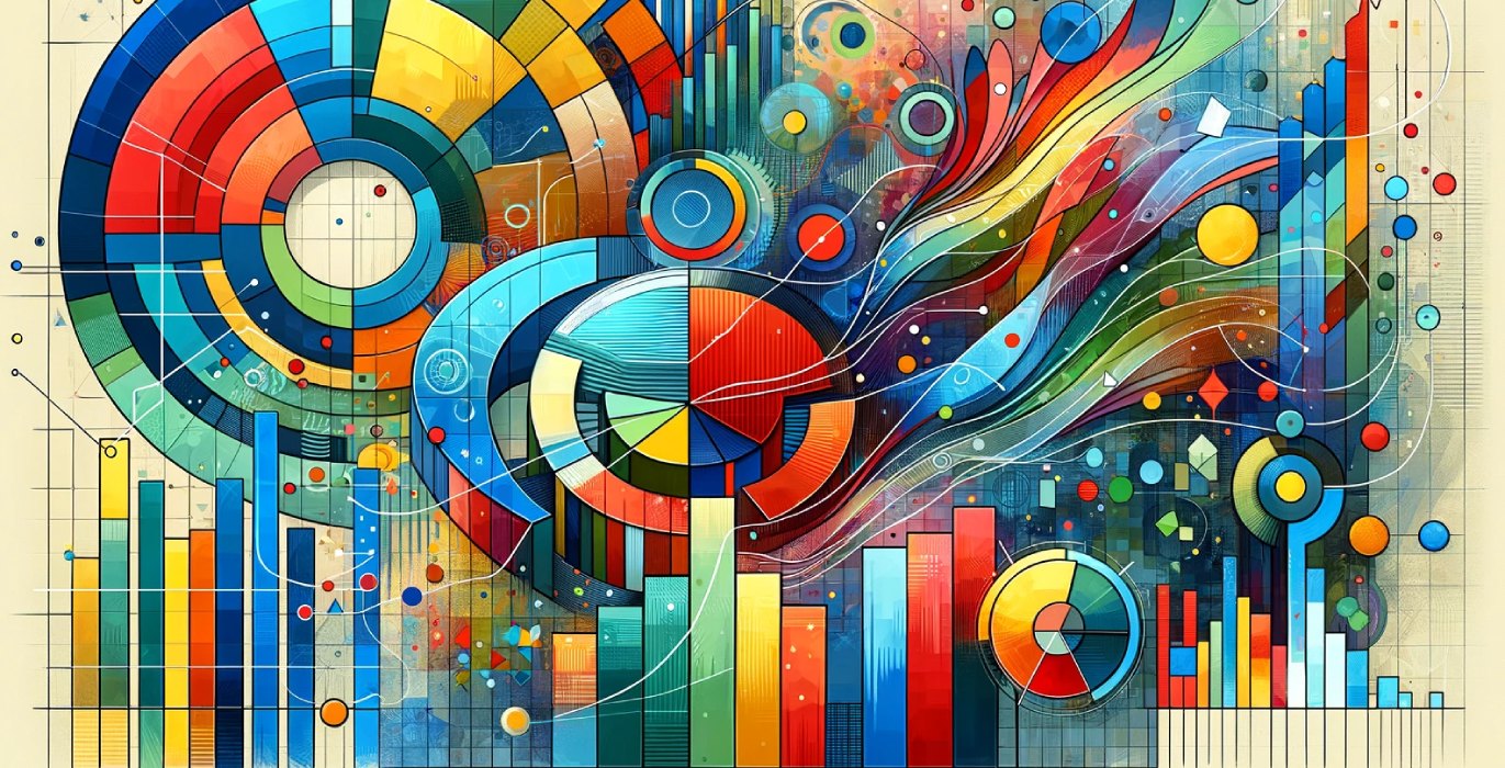
Data visualization: Choosing the right chart
Data is the new oil of companies, and the exploitation of data can set a company apart within the same sector. Thanks to the reduction in storage costs, a multitude of information is now available. Companies have large volumes of data at their disposal, and it is essential to give them shape so that they can be quickly and fully understood. It is in this context that the science of data visualization arises, which tries to provide a solution to the above problem, when human processing capacity is not enough to contrast and analyze massive amounts of information. Visualization allows, in a clear and direct way, to observe patterns, extreme values or distributions, among other possibilities, which help to make better decisions based on data. In this article, we will discuss the main functions that can be solved by means of an appropriate selection of specific graphs. As there are many different graphs and as this is an introductory text, we will focus on giving technical answers prioritizing the most used graphs. When constructing a dashboard, it should not be forgotten that, in addition to the wide range of graphics available, it is essential to take into account the context and the target audience. Proportional views In this section we will look at those graphs that respond to the need to create a proportion between values. Graphs like the bubble graph, Nightingale Rose graph, proportional area graph or word cloud would give good results. In case of looking for proportional links that form part of a total, the graphs to implement would be the donut or ring graph, treemap, pie graph, and Sankey diagram. Hierarchy The most commonly used graphs to show the hierarchy between a set of variables are the tree diagram graph and the treemap. Concept visualization Graphs such as Venn diagrams or flowcharts would be used to visualize some ideas or concepts. Links To observe both connections and links between data or to show correlations between two or more variables, an example of the most common graphs would be the following: As far as correlations are concerned, the most appropriate charts are a bubble chart, heat map or dot plot. When it comes to showing only connections between different variables, the most suitable graphs are the connection map, network graph, tree diagram and the chord diagram. Locations The following are suitable methods for representing geographical regions: choropletic map, connection map, and point map. Distributions The following graphs are used to represent the frequency of a variable or its distribution, i.e., how it is distributed according to specific groupings. The graphs that help to capture this idea are boxplot or box-and-whiskers diagram, bubble graph, histogram, timeline, or the Tally graph. If you want to show the distribution of a variable segmented by a specific qualitative variable, whether it is sex, age or any other, the appropriate graph would be the pyramid. In the case of the word cloud, its use is optimal when dealing with the distribution of a text. Make a comparison Methods that allow us to show the main differences or similarities between values. We can differentiate all the possibilities depending on the need to incorporate axis or not the graphs. If they have an axis, the graphics to apply would be such as the bar graph, boxplot, bubble graph, bullet graph, line graph, stacked column graph, pyramid graph or area graph. If they do not incorporate an axis in their structure, the graphs to compare different variables would be some such as ring or donut graph, chord diagram, heat map, pie graph, treemap, among others. Movement Flows The visualization methods that allow to represent the movement of data or data flows are the connection map or the Sankey diagram. Partitions of a total This section discusses those visualization methods that allow to show parts of a total of one or more variables. Generally, the ring or donut graph, Mekko graph, pie graph, clustered column graph and treemap would give a correct result. Ranges Display methods that present the variations between maximum and minimum values on a scale. For this functionality the boxplot, bullet graph, candlestick graph, Gantt diagram among others will be a very good option to implement. Display processing and operation Visualization methods that allow to show how an object, a system, works, where the final output is shown together with the processes that originate it. The most suitable graphics to show this type of functionality are the Sankey diagram or a flow graph, if what is desired is to focus on the explanation of processes or methods, the most advisable graphic would be the Gantt diagram. Temporal data observation This function presents the need to display data over a period of time as a way to find trends or changes over time. The graphs to employ could be the Nightingale Rose graph, stacked area graph, heat map, bubble graph, candlestick graph or line graph among others. This section, which primarily serves to observe how data oscillates over time, also features graphs that could be used to represent the sequence of events over time. Graphs such as a timetable, a timeline or a calendar table can help to represent this type of information. Discover hidden patterns When selecting the graph, if the aim is to find hidden patterns within the data, the range of possibilities is very wide, and you can select one from a multitude of graphs. In this case, the most commonly used graphs are the area graph, bar graph, boxplot, bubble graph, candlestick graph, connection map, dot plot, heat map, line graph, population pyramid, dot plot, choropleth map, among others. Conclusion Data visualization is an indispensable tool to give shape and structure to data and to understand it quickly and effectively. Graphs are a clear and direct way to visualize patterns and distributions in data, which helps to make decisions based on more accurate information. Although as we have seen there are many types of graphs, it is important to select those that are most appropriate for each situation taking into account the context and the target audience. Therefore, the right choice of chart is essential to make the most of the potential of the data and get the most out of it. AI of Things How to start programming in Artificial Intelligence: languages, tools and recommendations January 18, 2023 Images from Freepik and Figma.
December 13, 2023